Visual Design
Brand Foundations & Identity Work
Identity work focused on establishing clear visual foundations that support recognition, cohesion, and long-term adaptability across touchpoints.
-
Travis Christian Assembly. Hippo Express. Brushy Creek Cafe.
1 min
No

Brand Design
Visual Design
Information Hierarchy
Consistency
Overview
Context
Across projects including Travis Christian Assembly and small local businesses (Brushy Creek Café, Hippo Express), I worked on brand identity foundations that needed to balance personality with clarity and long-term usability.
My Role
Brand & Visual Designer · Identity Foundations
The Design Problem
Each organization required a visual identity that could scale beyond a logo.
What needed solving
Lack of consistent visual language across touchpoints
Brand visuals that needed to feel distinctive yet practical
Ensuring logos worked across digital, print, and signage formats
Creating identities that could evolve without constant redesign
The goal wasn’t just to design a mark—it was to establish visual direction.
Design Approach
Each organization required a visual identity that could scale beyond a logo.
What needed solving
Lack of consistent visual language across touchpoints
Brand visuals that needed to feel distinctive yet practical
Ensuring logos worked across digital, print, and signage formats
Creating identities that could evolve without constant redesign
The goal wasn’t just to design a mark—it was to establish visual direction.
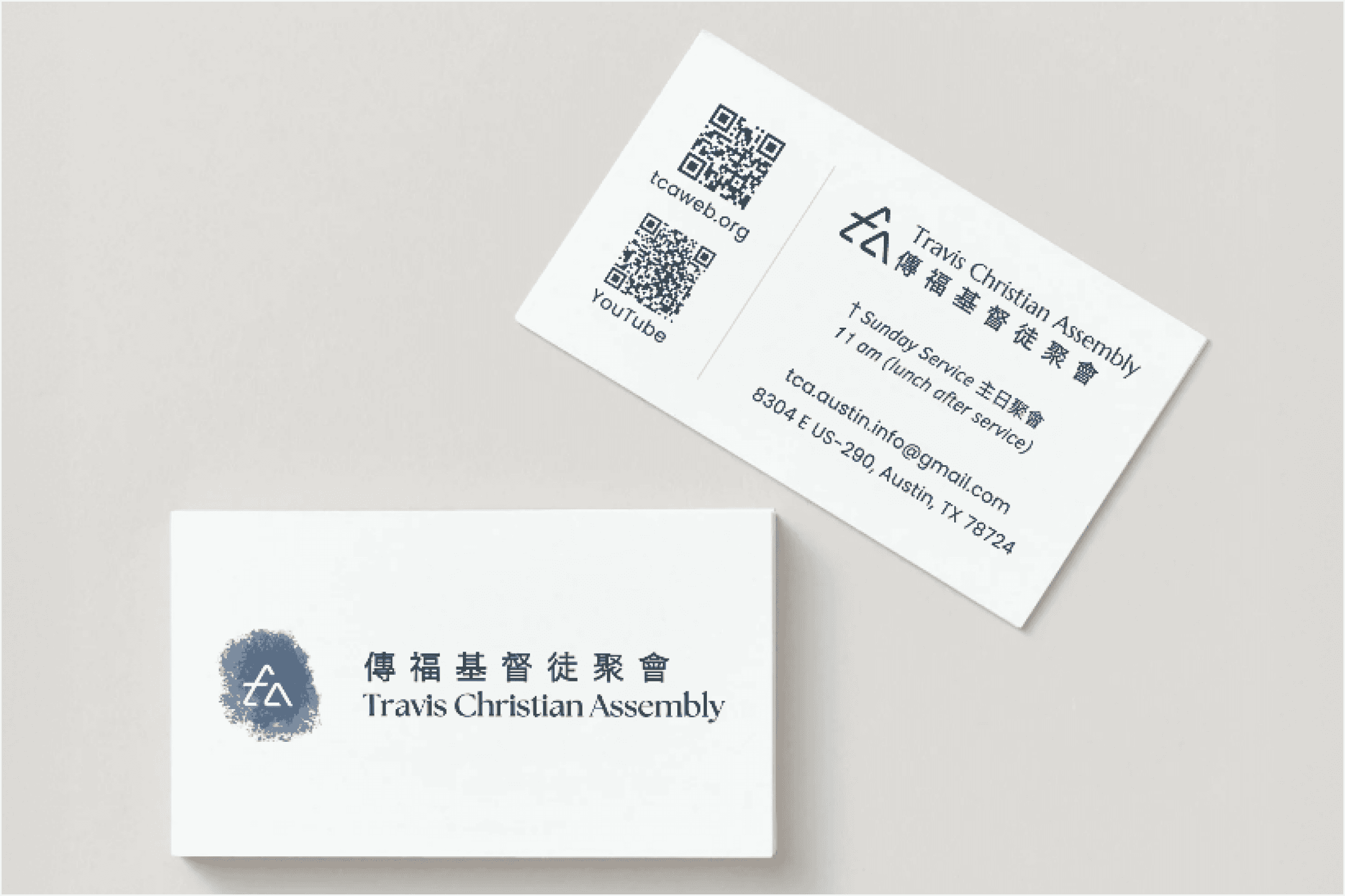
Logo design - business card
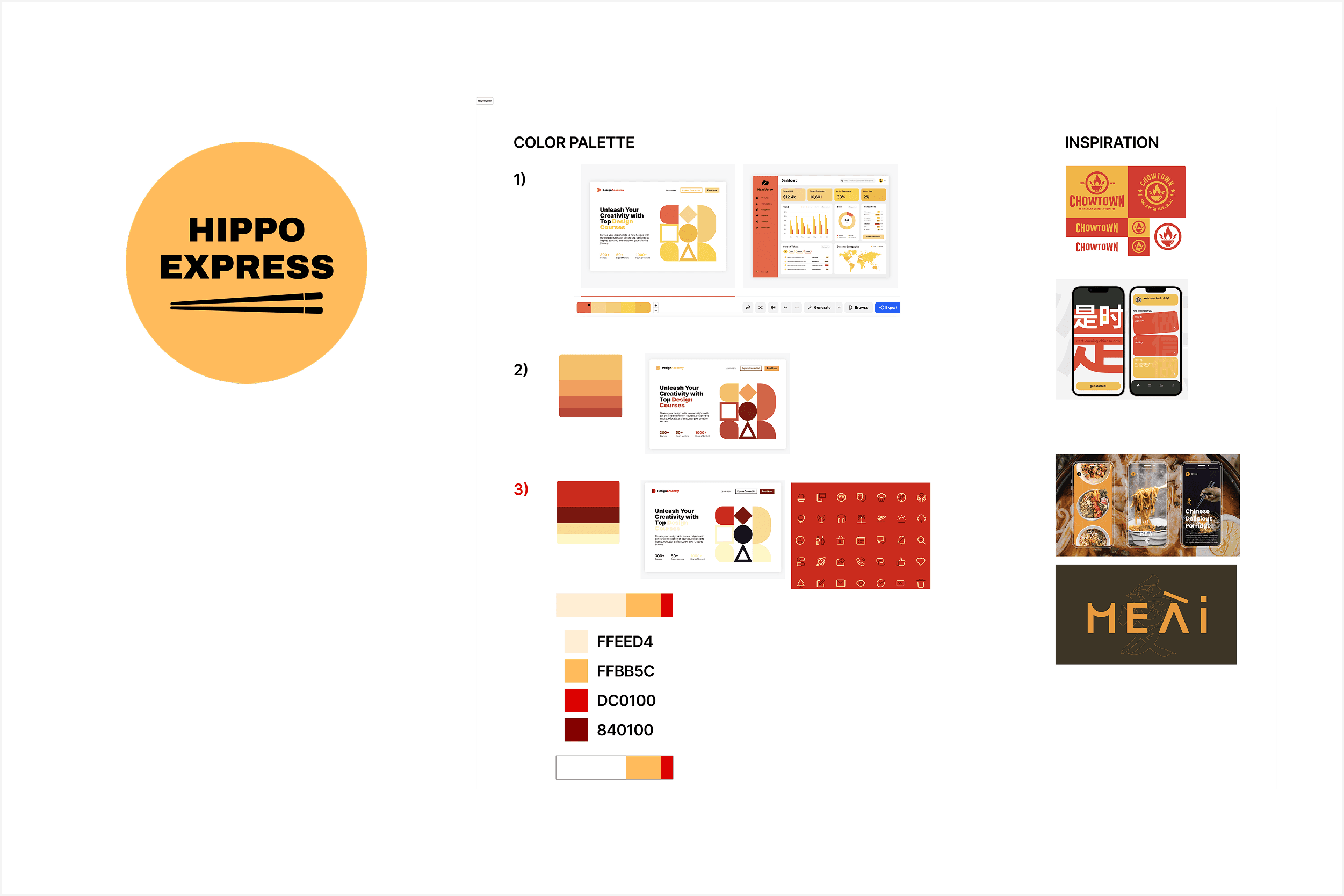
Logo design - process
System in Use
These foundations supported consistent application across:
Event materials and church communications (TCA)
Restaurant branding and packaging (Brushy Creek Café, Hippo Express)
Digital and print environments
Logos were designed to remain legible, recognizable, and flexible across platforms—ensuring usability beyond presentation mockups.
Impact on Team & Product
Strengthened visual recognition across platforms
Reduced inconsistency in brand applications
Provided clear direction for future marketing materials
Created adaptable foundations that didn’t require frequent redesign
Reflection
Brand identity is most effective when it functions as a system rather than a symbol. Establishing clear foundations ensures that visual language remains cohesive as organizations grow and evolve.
More in Visual Design

Designing Repeatable Event Communication for a Community
Designed a flexible flyer system for recurring church events—balancing clarity, cultural context, and seasonal variation while maintaining a consistent visual identity.

Designing Modular Visual Systems for a Fintech Team
Designed reusable visual systems—email templates, document layouts, and brand assets—that balanced compliance, clarity, and flexibility while enabling teams to self-serve without constant design support.
Editor's Picks
Auditing and Scaling a Design System for Enterprise SaaS
How we reduced inconsistency while enabling faster product iteration.

End-to-End Website Redesigns with Ownership
Led end-to-end website redesigns for client organizations, owning projects from discovery through MVP launch while coordinating design, development, and research to deliver on time and at quality.